Homemade t-shirts, bumper stickers, and blog posts with your logo are your fans’ way of expressing their love for your brand. You can make it easier for them to show it by making your logo available to copy and paste.
But let’s say you’re worried about the branding you worked so hard to achieve getting tossed around in Photoshop and coming out looking less than great. Instead of putting restrictions on the use of your logo, why not show them the best way to use it?
MailChimp does this with an entire page dedicated to guidelines for using their brand assets. They show you which colors, fonts, and sizes to use and how to represent their mascot well. Each asset can be downloaded right from the page.
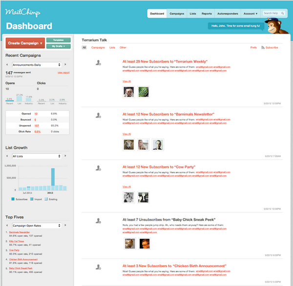
They even have recommended screenshots to use when you talk about them — like this one:
For better or worse, people are going to talk about you. Why not help them do it the way you hope they would?


